‘येLo’ consumer app was going to be the first product of the company along with its Corporate portal for business use. Release and response to the app was going to be very critical for the company and its future strategies.
Conceptualising and developing the product form the scratch and releasing it to the market within 6 months.
Objective was to make sure that the primary product design phase gets finished within 2 months so that the tech team gets enough time to develop and test the product.
‘येLo’ app should be easy to use and encouraging enough to let the user do online money transactions comfortably.
At the time I joined and till the first product release, we were not a big team and I alone was responsible for all whole UX/UI and other design related work.
Qualitative Research, UX Design, Visual Design, Prototyping and Testing. Also Branding, Marketing content, Creatives and Flyers.
My process will be different in different projects and will be determined by many factors such as the project goals, business needs, complexity of the problem, time and etc. Here I’ll describe my process for solving this problem.


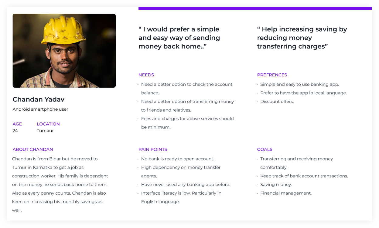
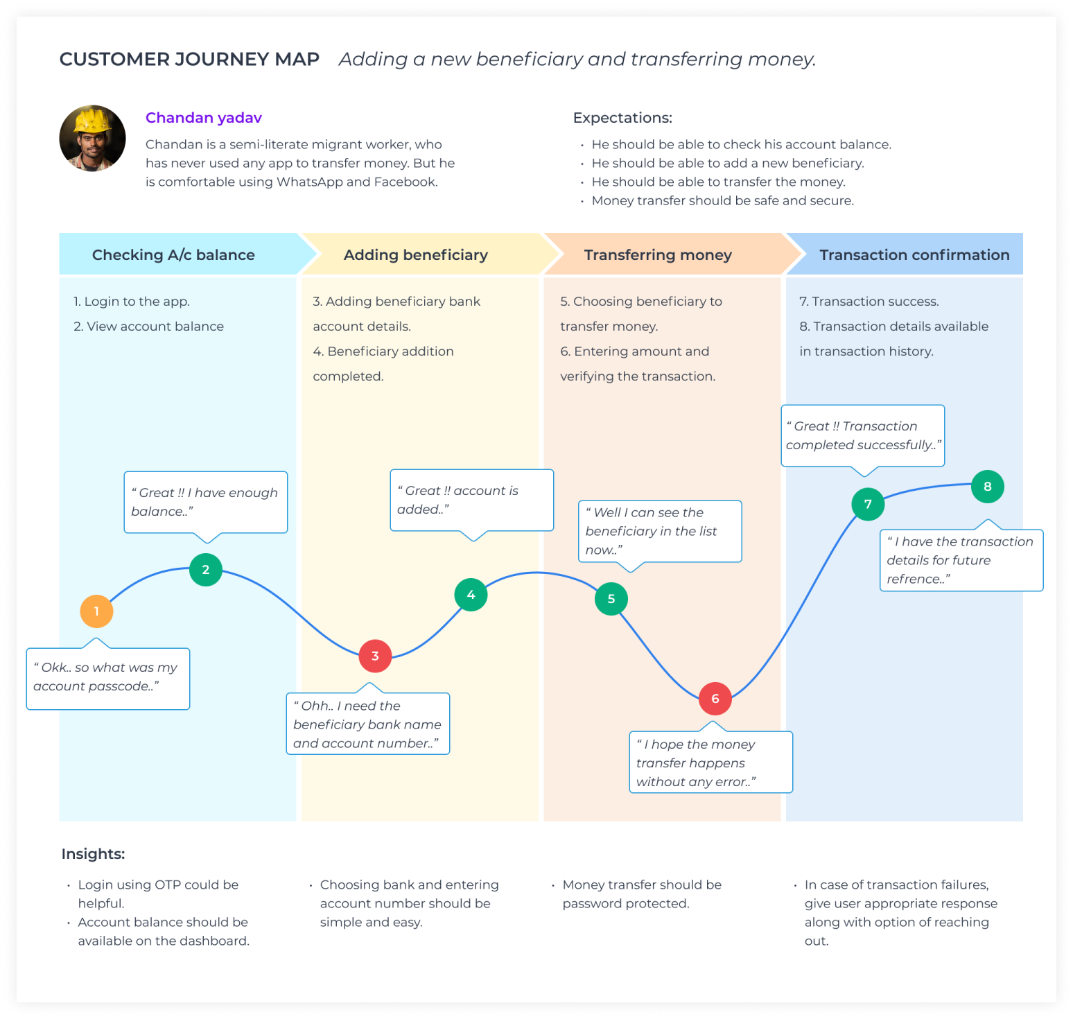
Most of the initial insights about the user were shared by the product heads and managers. Along with that we managed to conduct a few interviews also to identify the pain points, opportunity and insights. These interviews also helped us to validate some of our existing assumptions. I found patterns in users perceptions and tasks and aggregated my findings in the form of a persona.
The research made it evident the need of a product like Yelo. It also emphasised to keep the app simple and in local language. After summarizing the information from user interviews and data analysis, It was the time to sketch different solutions to help business and users.
In this step I involved PM and devs to discuss about the different solutions and prioritize them.
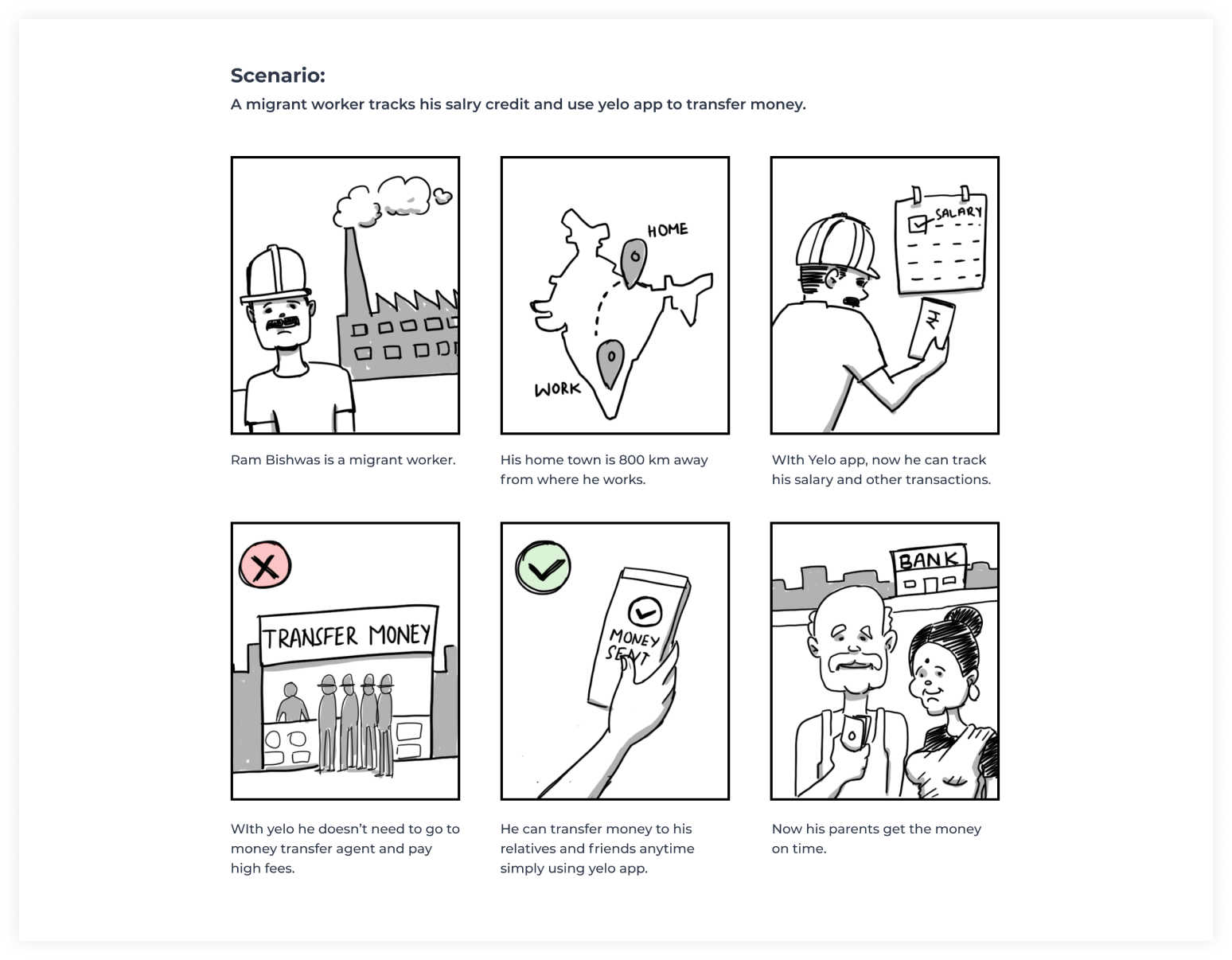
I created a storyboard describing my user’s experience with the app.
After talking with different users and understanding their story and their needs before starting designing any pages it was the time to create a persona and the story to create an empathy with users and design a product that works for them.
Creating UX flow helps me to understand the whole user journey and cover all the screens.
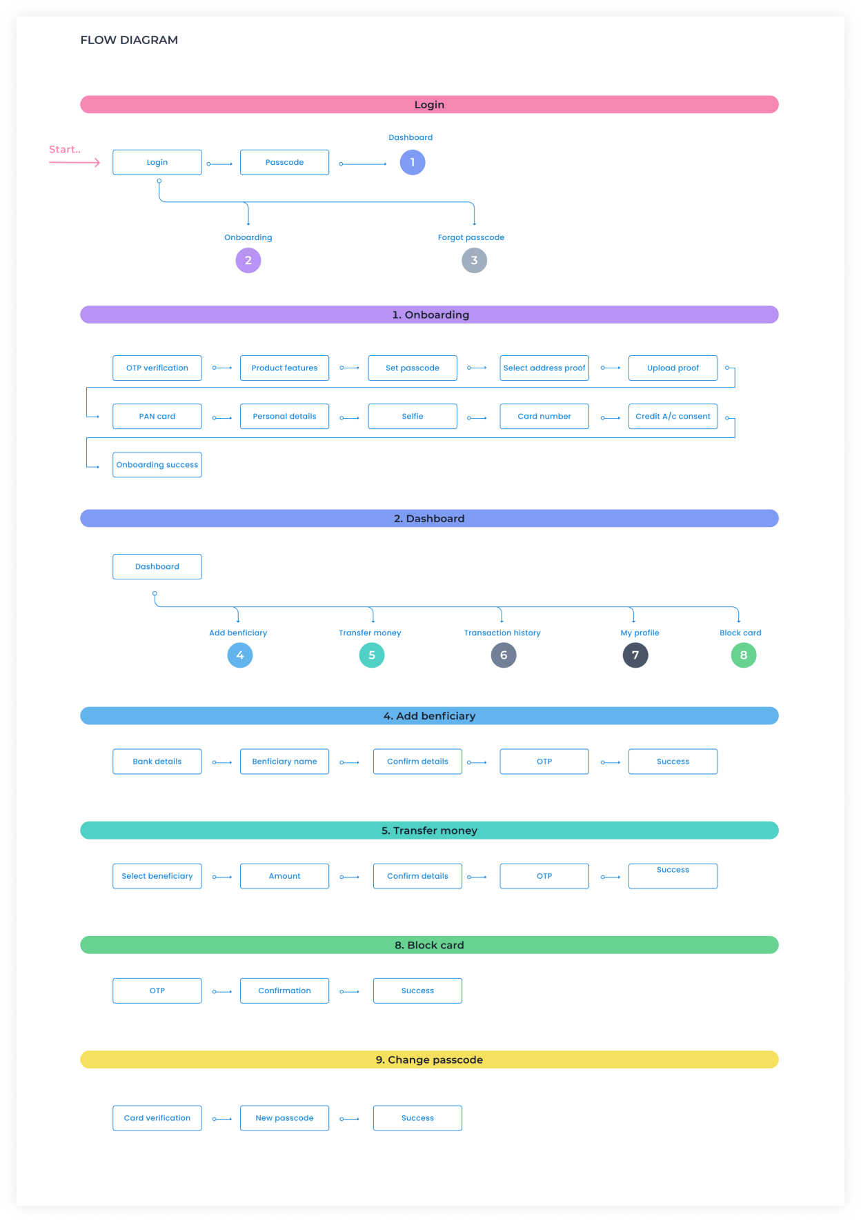
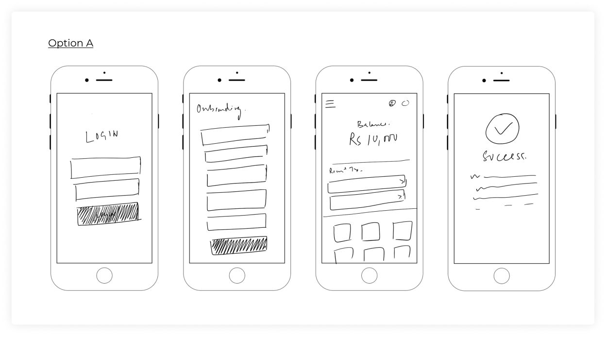
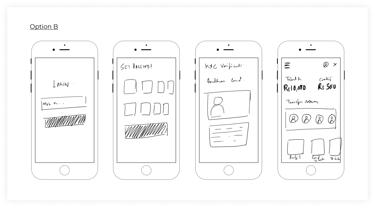
Once the user flows were ready I started working on wireframes for multiple screens covering various flows. Wireframes help in putting the details and making sure that all the required information is covered and all the scenarios are handled properly. In this step I also made a prototype to test the solution with users and fix the problems in the early stage.
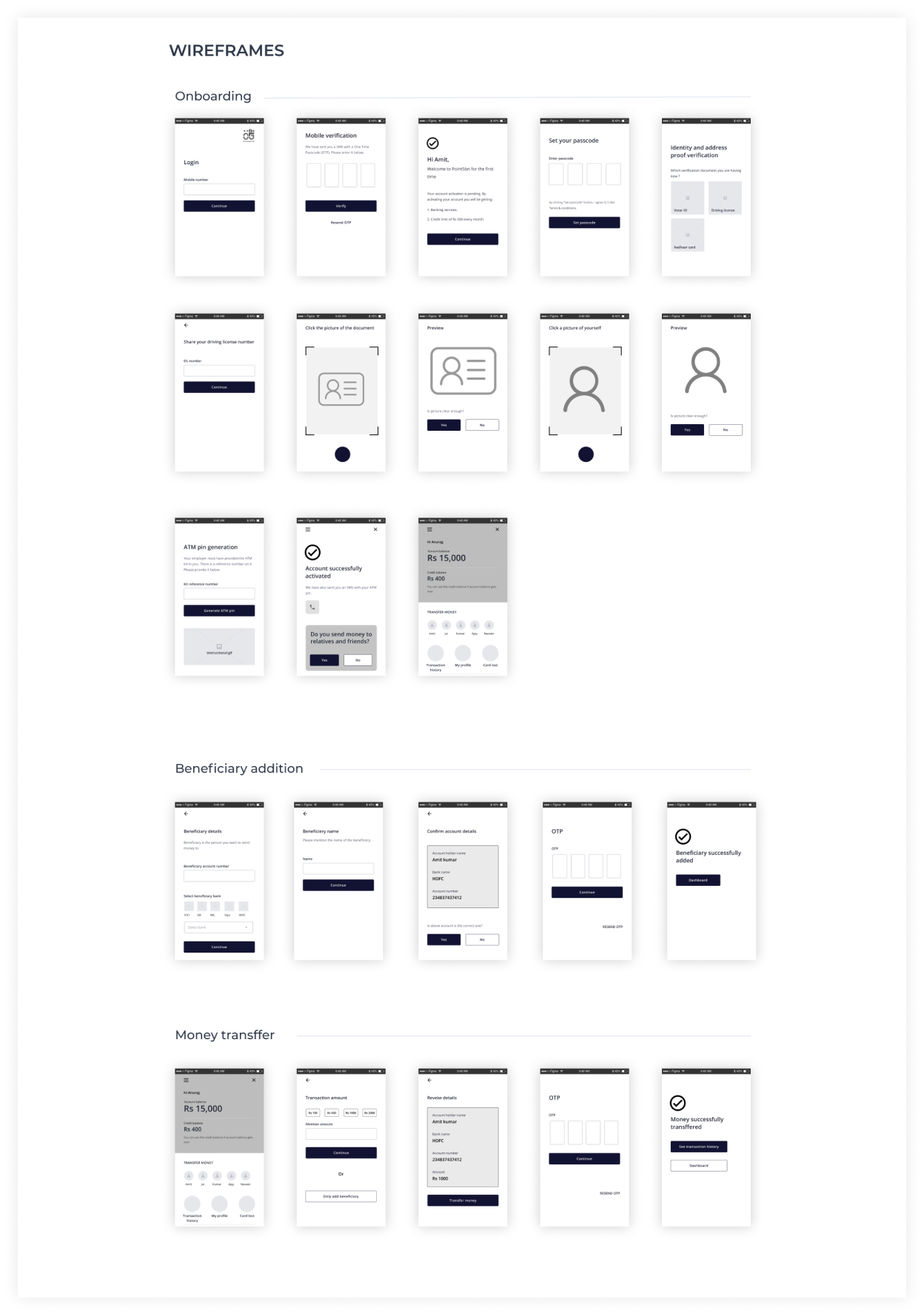
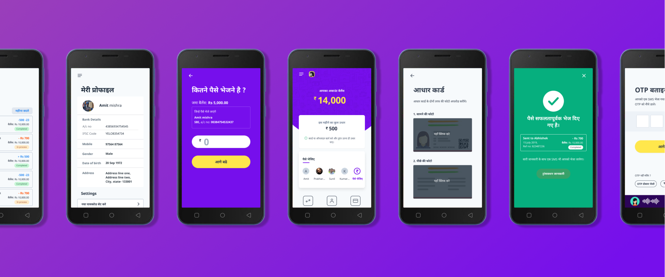
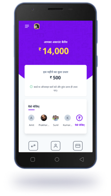
Here I am showing some of the screens designed for the Login, Onboarding, Dashboard, Money transfer and Transaction history flows.