WishFin is a platform run by Mywish Marketplaces Private Limited (MMPL). Wishfin runs neutral financial marketplaces that leverage its proprietary technology to intermediate between the banks and customers seeking banking products like Loans, Credit cards etc. MMPL has close to 10 Million customers. Franklin Templeton recently invested $15 million in MMPL.
WishFin wanted to step into the Mutual fund platform market so that it can add one more product to its bouquet of financial products for its customers.
Mutual fund domain was completely new to Wishfin. Understanding the domain and then creating a mutual fund platform which encourages the user to invest in mutual funds was the real challenge.
Corporate portal should be simple and easy to use. Corporates should be able to create bank account requests for their employees and once the account is opened they should be able to process the salary to these accounts using digital means.
Launching a mutual fund platform within 6 months. New product should be seamlessly integrated with the existing Wishfin platform. Users should be able to invest to do lumpsum and SIP investments.
At Wishfin I was heading the UX/ UI design team as well as UI development team. Design team included me and a visual designer. UI development team had three developers.
Qualitative Research, UX Design, Partial Visual Design, UI development.
My process will be different in different projects and will be determined by many factors such as the project goals, business needs, complexity of the problem, time and etc. Here I’ll describe my process for solving this problem.


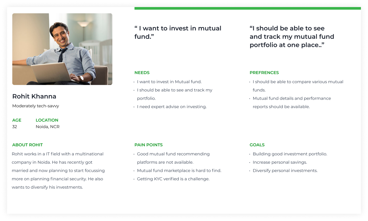
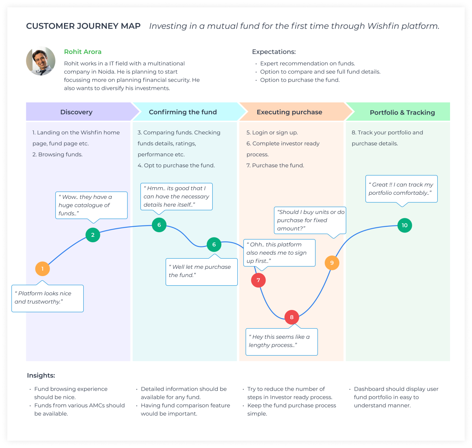
Most of the initial insights about the user were shared by the product head and mutual fund sales managers. Due to time constraints we were not able to do enough customer interviews so I used the strategy of visiting various mutual fund discussion forms and extract insights from those places. Based on the insights a basic consumer persona was created.
Initial discussion and research made it clear that we needed to make a mutual fund platform that have the option of viewing, comparing, lumpsum buying and SIP investment. It was the time to sketch different solutions.
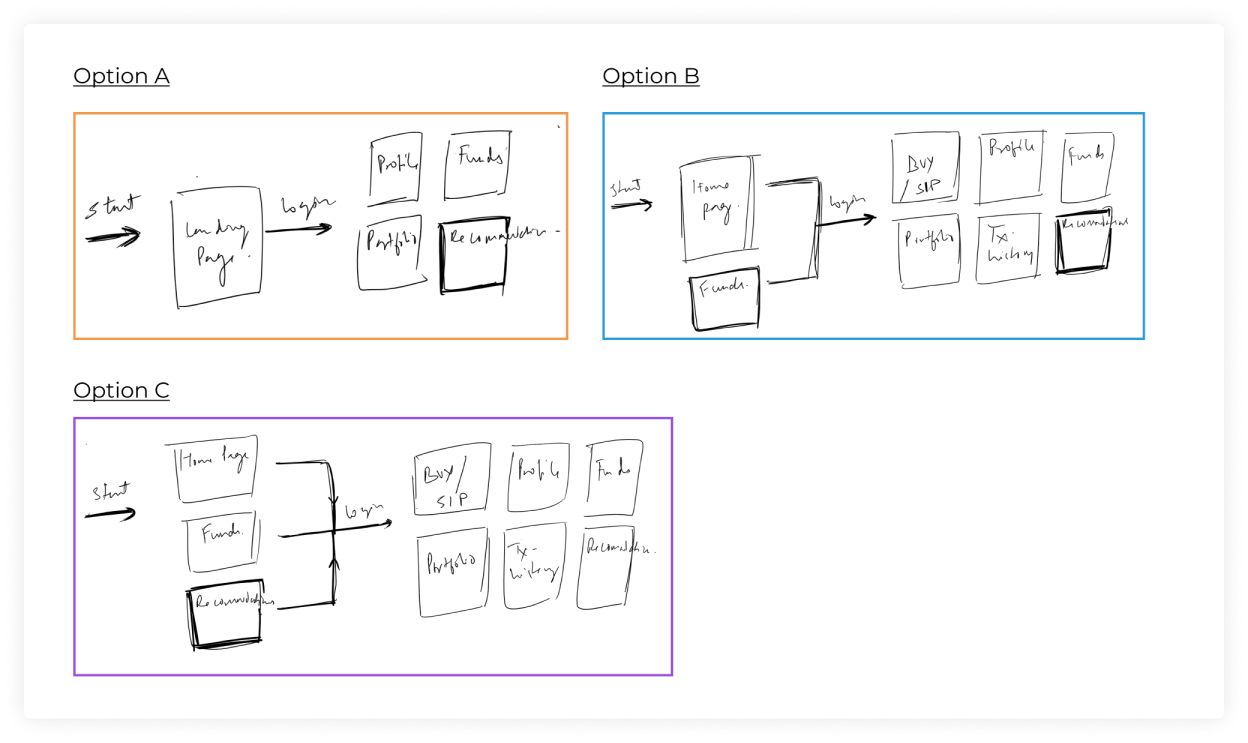
In this step I involved PM and devs to discuss about the different solutions and prioritize them.
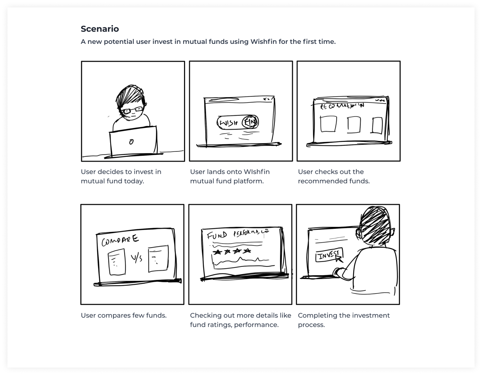
I created a storyboard describing a mutual fund investor’s experience with the portal.
After collecting various possible insights and understanding user needs before starting designing any pages it was the time to create a persona and the story to create an empathy with users and design a product that works for them.
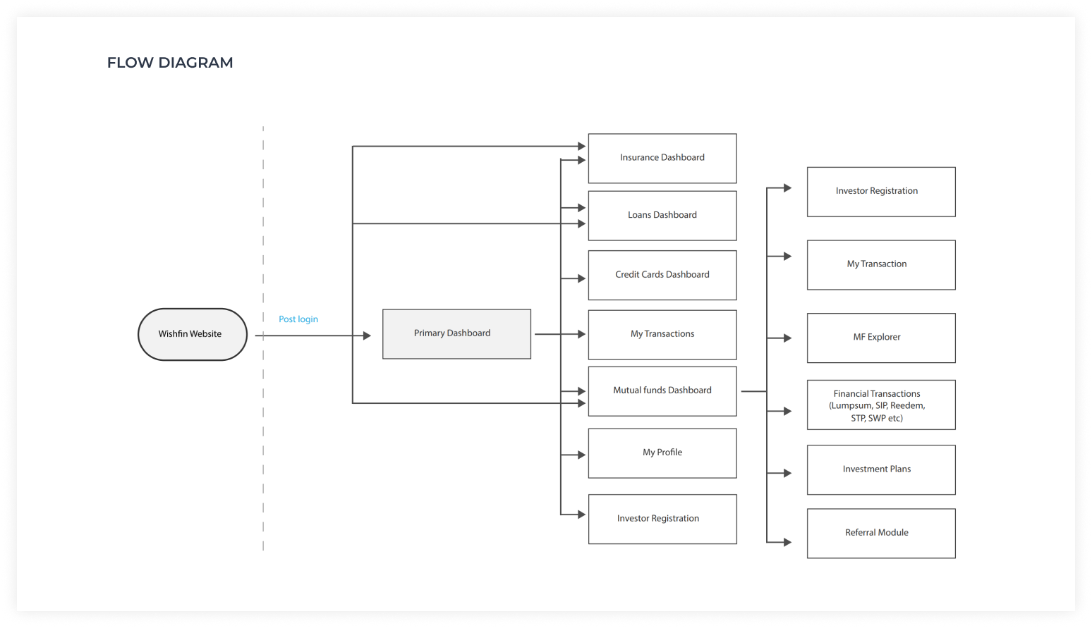
Creating UX flow helps me to understand the whole user journey and cover all the screens.
Once the user flows were ready I started working on wireframes for multiple screens covering various flows. Wireframes help in putting the details and making sure that all the required information is covered and all the scenarios are handled properly.
Due to time constraints I was not able to do any prototyping at this stage.
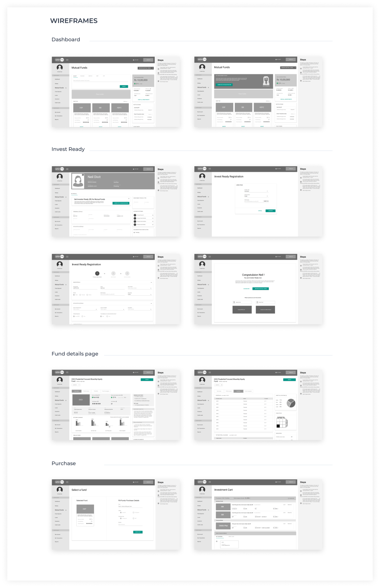
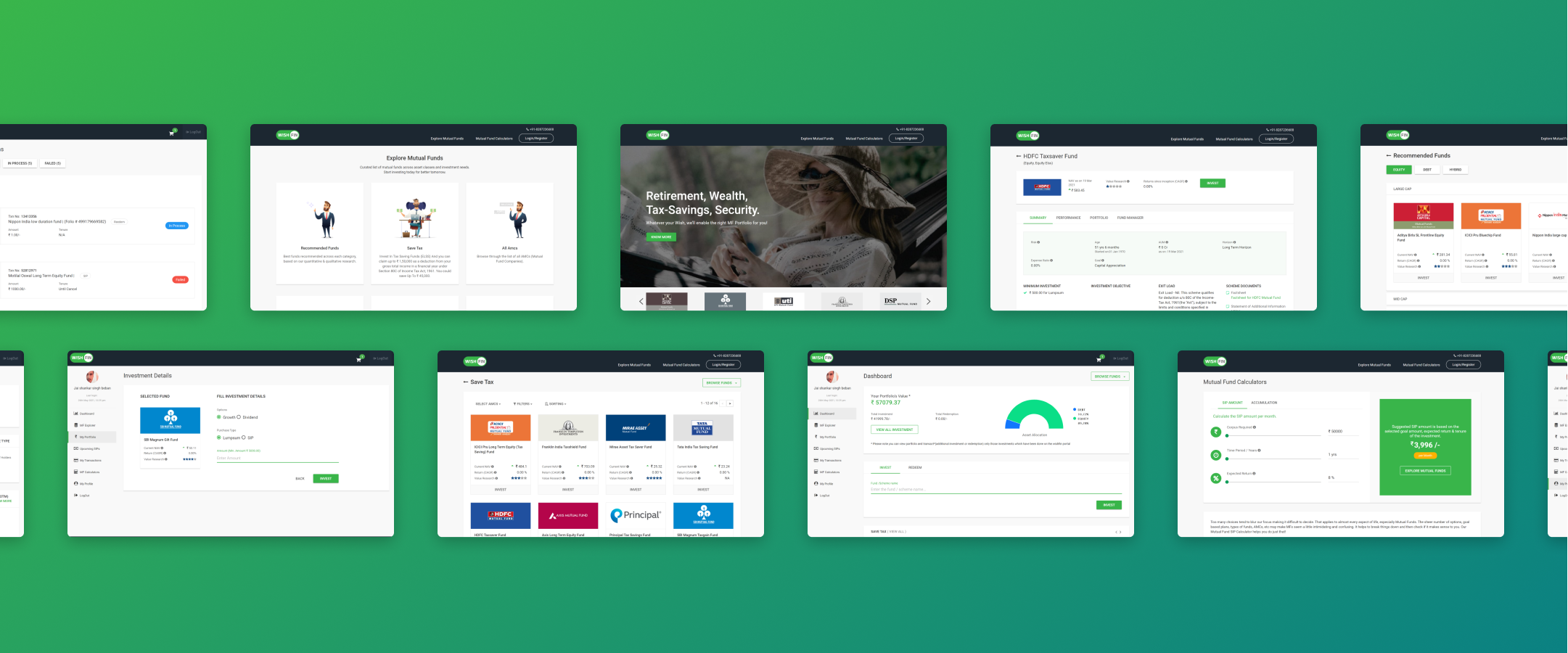
Here I am showing some of the screens designed for the Login, Dashboard, Investor ready, Profile page, Mutual fund explorer, Transaction history flows etc.