येLo (0.5Bn FinHealth Pvt. Ltd) is an upcoming startup which is focussed on improving the financial health of the mass market consumer, the ‘Next Half Billion’ people who will be coming online in the next five years.
As part of the market penetration strategy, येLo wanted to reach out to the corporates which employ blue collar workers so that through them they can make their flagship product ‘येLo’ available to the end customer.
Many corporate companies still process the salary in cash and yet have not adopted the digital solution.
Corporate portal should be simple and easy to use. Corporates should be able to create bank account requests for their employees and once the account is opened they should be able to process the salary to these accounts using digital means.
At the time I joined and till the first product release, we were not a big team and I alone was responsible for all whole UX/UI and other design related work.
Qualitative Research, UX Design, Visual Design, Prototyping and Testing. Also Branding, Marketing content, Creatives and Flyers.
My process will be different in different projects and will be determined by many factors such as the project goals, business needs, complexity of the problem, time and etc. Here I’ll describe my process for solving this problem.


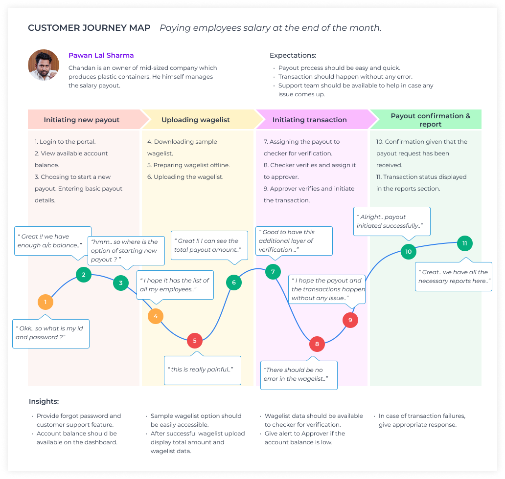
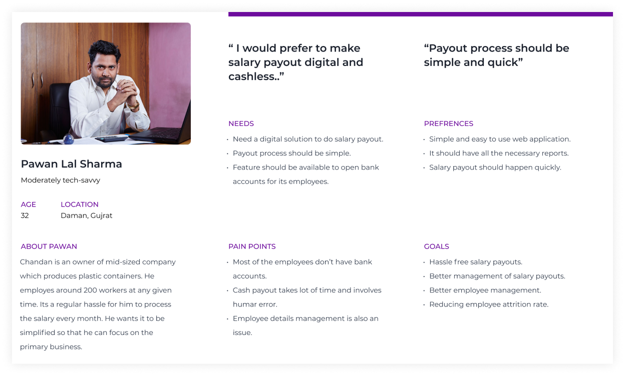
Most of the initial insights about the user were shared by the product heads and managers. Along with that we managed to conduct a few interviews also to identify the pain points, opportunity and insights. These interviews also helped us to validate some of our existing assumptions. I found patterns in users perceptions and tasks and aggregated my findings in the form of a persona.
The research made it evident the need of a product like Yelo. It also emphasised to keep the app simple and in local language. After summarizing the information from user interviews and data analysis, It was the time to sketch different solutions to help business and users.
In this step I involved PM and devs to discuss about the different solutions and prioritize them.
Creating UX flow helps me to understand the whole user journey and cover all the screens.
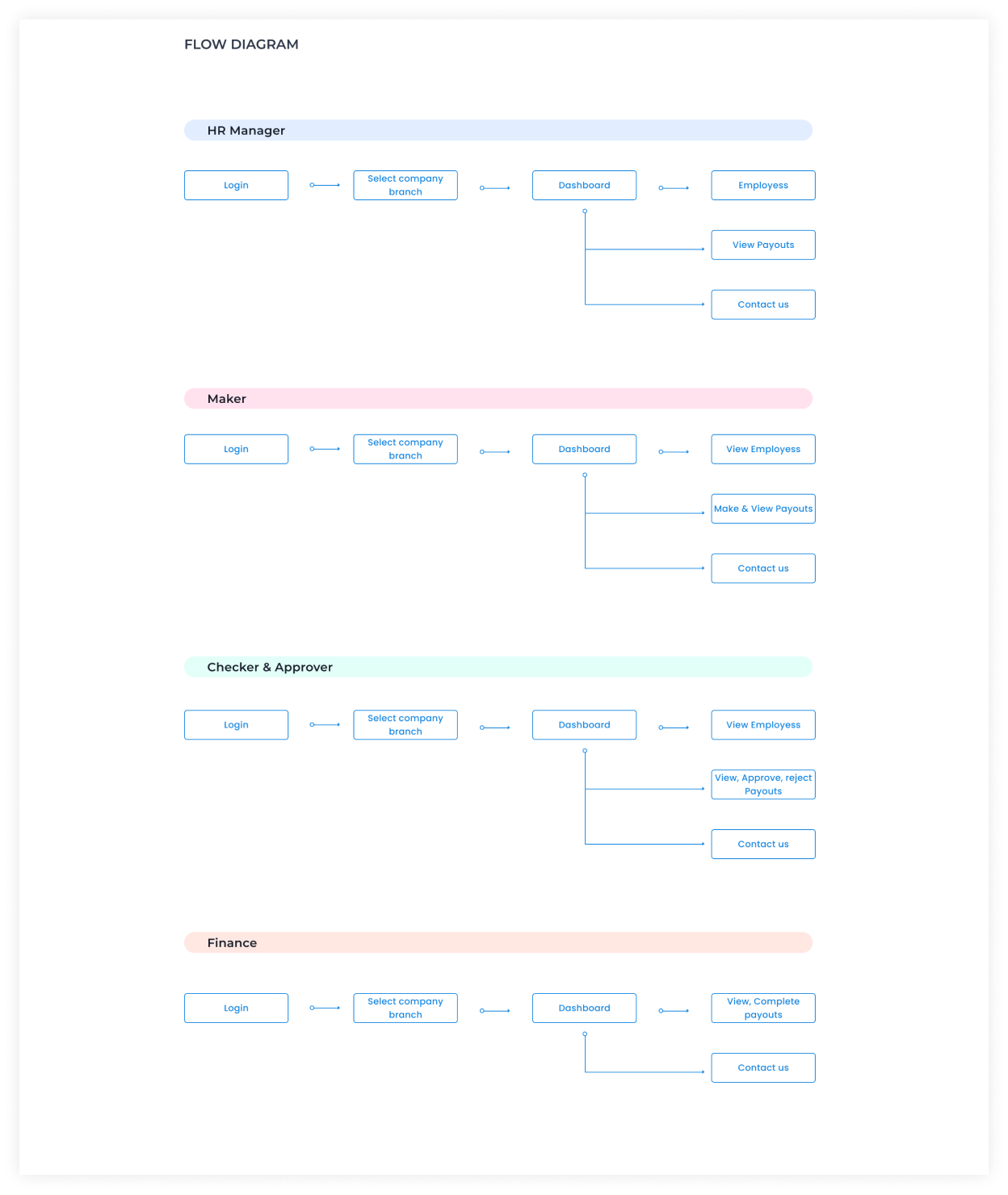
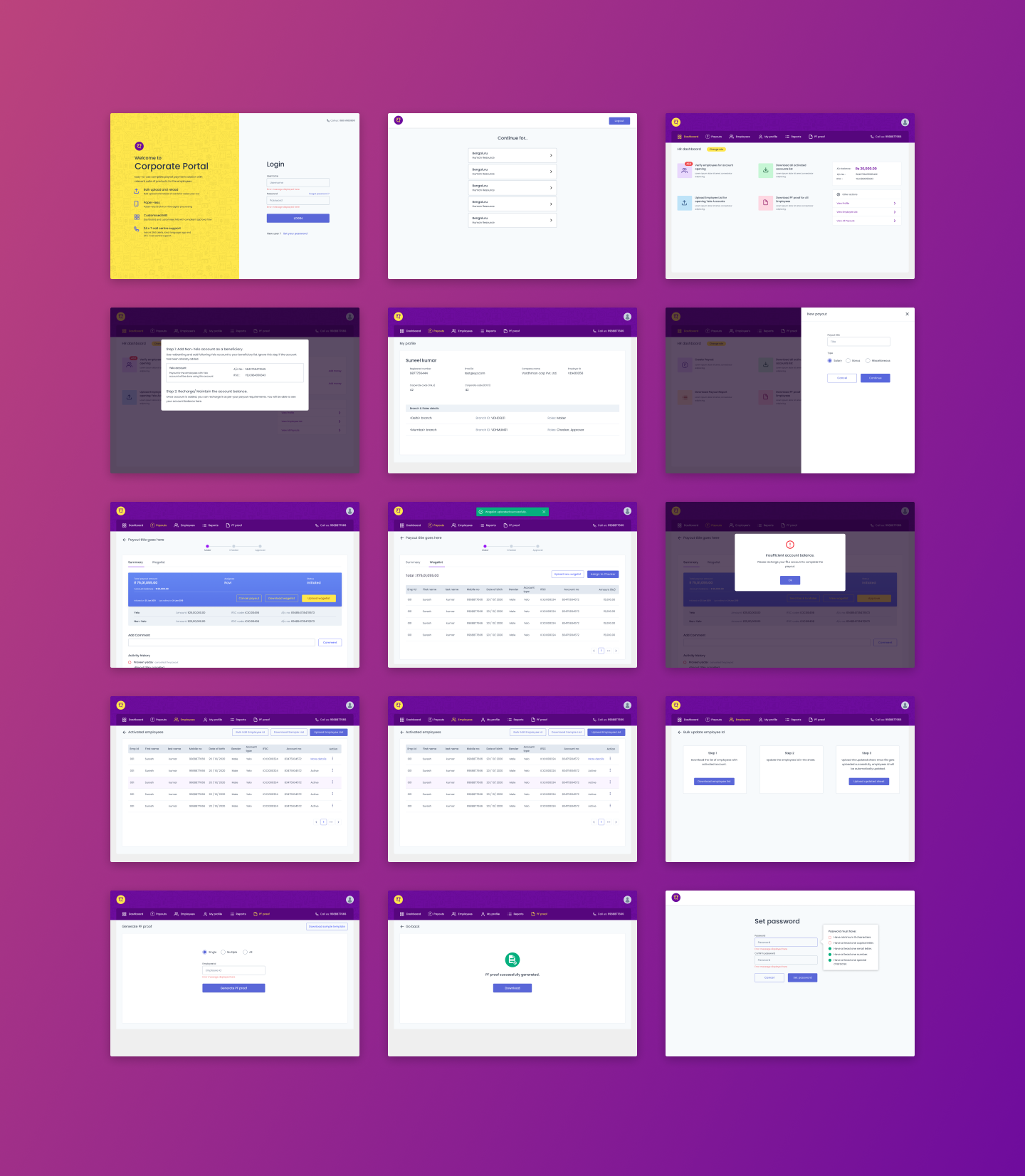
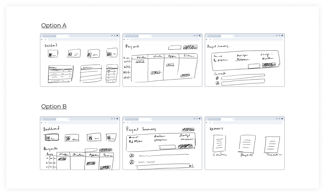
Once the user flows were ready I started working on wireframes for multiple screens covering various flows. Wireframes help in putting the details and making sure that all the required information is covered and all the scenarios are handled properly. In this step I also made a prototype to test the solution with users and fix the problems in the early stage.
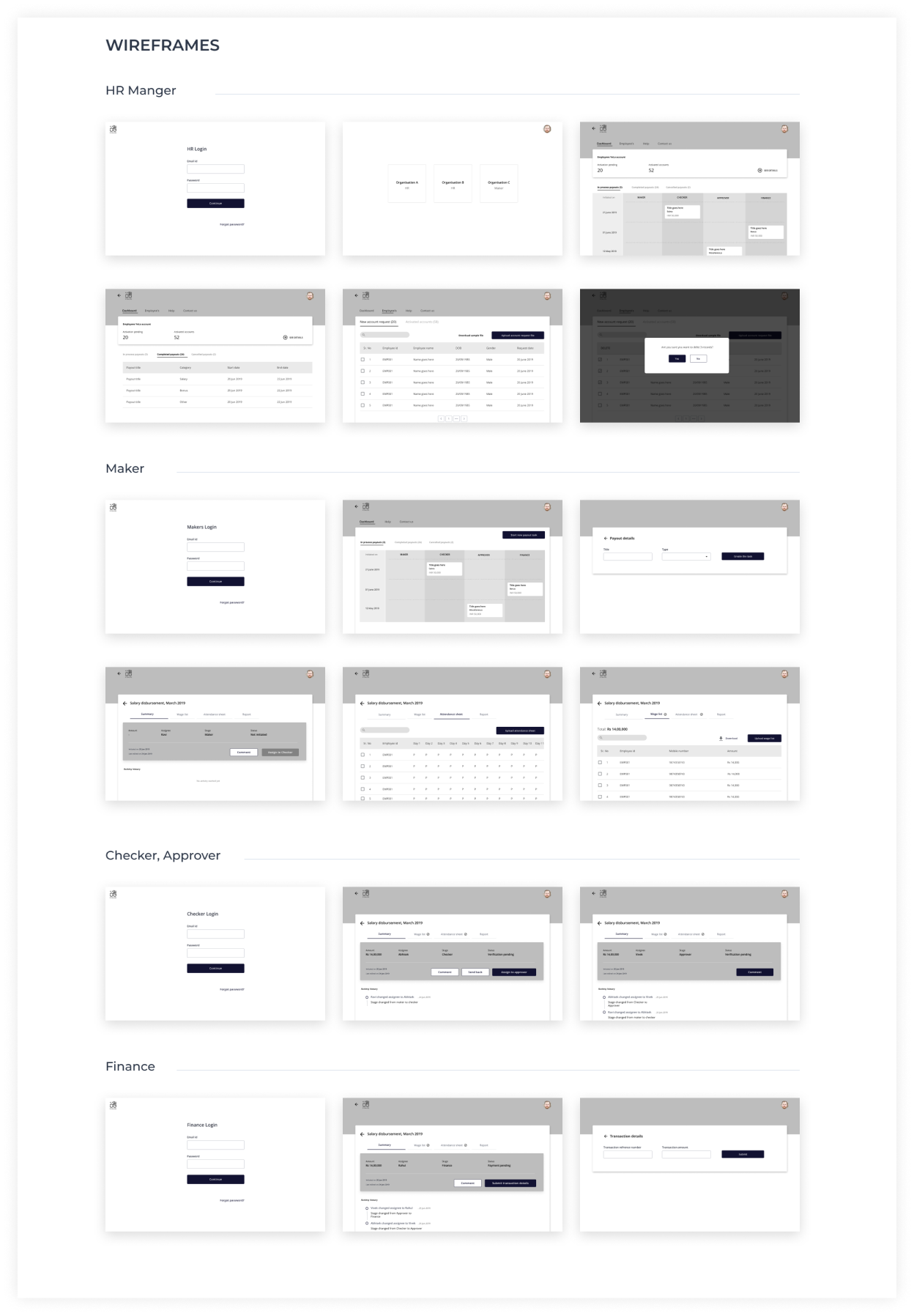
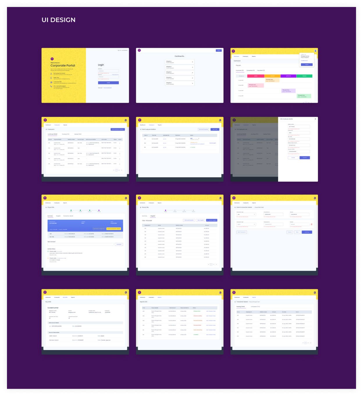
Here I am showing some of the screens designed for the Login, Dashboard for various roles, Payout process, Reports etc.
Feedback: Primary navigation issues.
1. Changes in UI. Primary navigation made more clear.
2. Quick links with explanations provided on the dashboard.
Feedback: One user would be performing many roles.
Single user would be able to switch among different roles. User isn't required to log out and login to another role anymore.
Feedback: Employers expect Yelo to manage the employee onboarding process, including collecting information from the employees. But the employer would like to approve before any account activation process begins.
Feature added.
Feedback: Required additional feature of PF proofs for the employees.
Feature added.
Feedback: Sample wagelist should be prefilled with the employees list.
Feature added.
Feedback: Employers should be able to check the available balance in their current account.
1. Feature added.
2. Account balance is displayed on the dashboard itself.
3. During the payout also, if the balance is low, user is notified.
Feedback: No need for a Finance role.
Feature removed.
Feedback: Payout should be initiated from within the portal.
Feature added.